The Text Notation Element lets you create contents that consist of animation that highlights or emphasizes a word or phrase.
Content Options
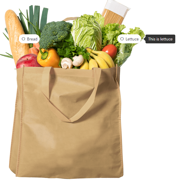
Image
Select an image for the element.
Custom Alt Text
Enter the text for the alt attribute for the html tag of the image.
Loading
Choose the loading type of the image either 'lazy' or 'eager'.
Show Title
You can enable this option if you want to show the image title when hovered.
Stretch
You can enable this option if you want to stretch the image width.
Hotspot Items
These are the hotspot items that will be positioned anywhere in the container and each item has these settings:
Title
- Title - Enter the text for the title of the hotspot item.
- Typography - Customize the color, font, size, weight, family, style, line height, and letter spacing, and add shadow to the title of the hotspot item.
- Margin - Sets the margin for the hotspot item.
- Padding - Sets the padding for the hotspot item.
Icon
- Icon - Choose the icon to display for the hotspot item.
- Icon Typography - Customize the color, font, size, style, and decoration, and add shadow to the hotspot icon item.
- Use Icon Image - You can enable this option if you want to display an image instead of an icon.
- Box Shadow - Settings of the box shadow of the hotspot icon item.
Placement
- Tooltip Placement - Select where to display the tooltip content.
Position
- X Position - Enter the number to adjust the horizontal position of the hotspot item.
- Y Position - Enter the number to adjust the vertical position of the hotspot item.
Styling
- Background - Sets the background of the hotspot item.
- Border - Settings of the border of the hotspot item.
- Box Shadow - Settings of the box shadow of the hotspot item.
Content
- Tooltip Content - Enter the text for the tooltip content of the hotspot item.
Link
- URL - Enter the link of the website you want to redirect your visitors to if they click the hotspot.
Pulse Animation
- Use Pulse Animation - You can enable this option if you want to add pulse animation to your hotspot item.
- CSS ID - Enter the text to add the CSS ID of the hotspot item.
- CSS Classes - Enter the text to add the CSS Class of the hotspot item.
Hotspot Item
Title
Typography
Customize the color, font, size, weight, family, style, line height, and letter spacing, and add shadow to all the hotspot titles.
Icon
Icon Typography
Customize the color, font, size, style, and decoration, and add shadow to all the icons used in the hotspot.
Icon Image Width
Enter the number to set the width of all the images used in the hotspot.
Settings the border for all icons or images used in the hotspot.
Icon Box Shadow
Settings of the box shadow for all icons or images used in the hotspot.
Styling
Background
Sets the background for all the hotspot items in default.
Settings of the border for all the hotspot items are in default.
Box Shadow
Settings of the box shadow for all the hotspot items in default.
Align Items
Select the preferred horizontal alignment for all hotspot titles.
Min Height in PX
Enter the number to set the min-height of all the hotspot items.
Min Width in PX
Enter the number to set the min-width of all the hotspot items.
Padding
Sets the padding for all the hotspot items.
Settings
Apply Placement to All Tooltip
You can enable this option if you want to have the same placement for all tooltips. If enabled, this will take priority over individual placement settings.
Tooltip Placement
Select where to display all the tooltip content.
Trigger Method
Select the type of trigger for the tooltip to appear.
Show Arrow
You can enable this option if you want to show the arrow of the tooltip.
Follow Cursor
You can enable this option if you want to the tooltip to follow the cursor within the hotspot item.
Max Width (PX)
Enter the number to set the max width of all the tooltip content.
Offset Skidding (PX)
Enter the number to set the offset skidding of all the tooltip content.
Offset Distance (PX)
Enter the number to set the offset distance of all the tooltip content.
Settings
Enter the number to set the transition in the delay of the tooltip animation.
Enter the number to set the transition out delay of the tooltip animation.
Enter the number to set the duration of the tooltip animation.
Animation
Select the type of animation when the tooltip is triggered.
Pulse Animation
Apply Pulse to All Hotspots
You can enable this option if you want to add pulse animation to all the hotspot items.
Tooltip Styling
Background
Sets the background color of the all tooltips.
Customize the color, font, size, weight, family, style, line height, and letter spacing, and add shadow to all the tooltips.
Settings for the border to all the tooltips.
Settings for the box shadow to all the tooltips.
Padding
Sets the padding to all the tooltips.