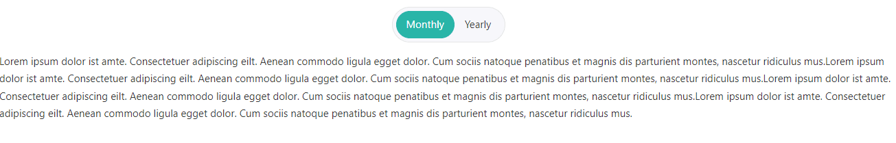
The Content Toggle Element lets you create multiple tabs and hide their contents depending on the chosen tabs to let the visitors focus on each tab one at a time.
Content Options
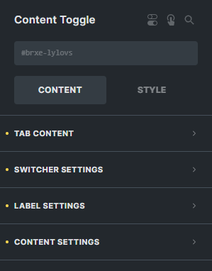
Tab Content
Content Toggle
The content toggle setting consist of four parts:
- Tab Title - Enter the text for your tab title.
- Content Type - Select the type either 'Content' which will let you customize your own content or 'Template' which will let you use an already created template.
- Content - Enter the text for the content of your tab.
- Add Tab Content - Click the 'Add Tab Content' if you want to add more tabs in your element.
Toggle Style
Select the style of your toggle when changin tabs either 'Normal Tab Style' or 'Animate Tab Style'.
Switcher Settings
Text Align
Sets the alignment of the switcher.
Switcher Background Color
Sets the background color of the switcher.
Bottom Gap
Sets the gap of the switcher from the content.
Border
Settings of the border for the switcher.
Box Shadow
Settings of the box shadow for the switcher.
Padding
Sets the padding for the switcher.
Label Settings
Label Active Background
Sets the background color of the active tab of the switcher.
Label Active Typography
Customize the color, font, size, weight, family, style, line height, and letter spacing, and add shadow of the active tab of the switcher.
Label Typography
Customize the color, font, size, weight, family, style, line height, and letter spacing, and add shadow of the normal tab of the switcher.
Padding
Sets the padding for each of the labels in the switcher.
Content Settings
Animation
Entry Animation
Select the animation type when it toggles from one content to another.
Animation Duration
The duration of the animation when content is toggled.
Animation Delay
The delay of the animation when content is toggled.