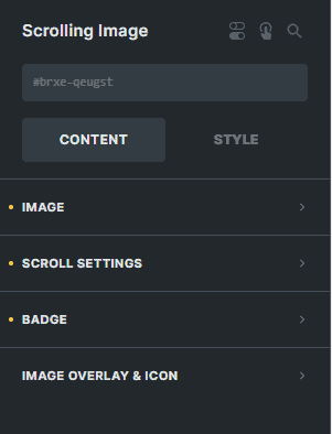
The Tilt Image Element is another interactive element of bricksable that lets the image scroll when hovered.

Content Options

Image
Select an image for the element.
HTML Tag
Select the HTML tag of your image.
Custom Alt Text
Enter the text for the alt attribute for the html tag of the image.
Loading
Choose the loading type of the image either 'lazy' or 'eager'.
Show Title
You can enable this option if you want to show the image title when hovered.
Stretch
You can enable this option if you want to stretch the image width.
Link To
Enter the link of the website you want to redirect your visitors to if they click the image.
Scroll Settings
Trigger
Choose the trigger method of the scrolling effect of the image either 'Hover' or "Enter Viewport'.
You can enable this option if you want to show the scrolling animation for 'Enter Viewport' once only. Leave it unchecked to show the scrolling animation without any limit.
Choose the scrolling direction of the image.
Enter the number to set the strolling speed of the image.
Enter the number to set the height of the container of the image.
Enter the number to set the width of the container of the image.
Badge
You can enable this option if you want to show the badge of the image.
You can enable this option if you want to show the badge of the image when hovered.
Enter the text for the badge of the image.
Image Overylay & Icon
Image Overlay
Sets the overlay color of the image.
You can enable this option if you want to show the overlay of the image when hovered.
Icon
You can enable this option if you want to disable the use of icons for this element.
Icon
Choose the icon to display for your element.
Icon Background Color
Sets the background color of the icon.
Icon Border
Settings of the border of the icon.
Icon Box Shadow
Settings of the box shadow of the icon.
Icon Height
Enter the number to set the height of the icon.
Icon Width
Enter the number to set the width of the icon.
Icon Typography
Customize the color, font, size, style, and decoration, and add shadow to the icon.
Hover Animation
Show Icon on Hover
You can enable this option if you want to show the icon of the image when hovered.
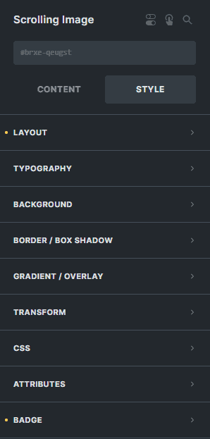
Style Options

Badge
Offset Left
Enter the number to adjust the horizontal position of the badge.
Offset Left
Enter the number to adjust the vertical position of the badge.
Padding
Sets the padding of the badge.
Text Color
Sets the color of the badge.
Background Color
Sets the background color of the badge.
Border
Settings of the border of the badge.
Box Shadow
Settings of the box shadow of the badge.
Typography
Customize the color, font, size, weight, family, style, line height, and letter spacing, and add shadow to the badge.