The Multiple Heading Element is a unique heading widget that lets you create multiple heading titles within a single element it's customizable that lets you change the style and design for each heading within the element.

Content Options
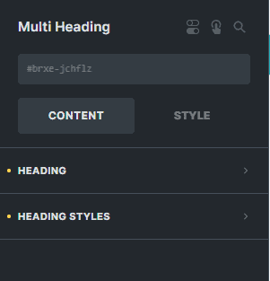
Heading
Each heading item in the list contains these settings:
- Heading Title - Enter the text for the heading title of your item.
- Link To - Enter the link of the website you want to redirect your visitors to if they click this heading item.
- Typography - Customize the color, font, size, weight, family, style, line height, and letter spacing, and add shadow to the heading item.
- Background - Sets the background color of the heading item.
- Use Background Text Mask - You can enable this option if you want to use an image as the mask of the text.
- Text Mask Image - Select an image to use as the background mask of the text.
- Use Gradient/Overlay - You can enable this option if you want to use gradient/overlay as the background for this heading item.
- Border - Sets the background color for this heading item.
- Box Shadow - Settings of the box shadow for this heading item.
- Padding - Sets the padding for this heading item.
Tag
Select the HTML tag for all the heading items.
Style
Select a style for default-styled heading items. The selected 'Style' setting will not be applied if the heading is applied with a customized style.
Link To
Enter the link of the website you want to redirect your visitors to if they click the container.
Heading Styles
Vertical Align
Select the vertical alignment of the whole element.
Gap
Enter the number to set the gap between title headings within the element.
Display
Choose the display type for the items if either 'Row' or 'Column'.