The Flip Box Element lets you create two different contents from one box that flips every time it hovers.

Content Options
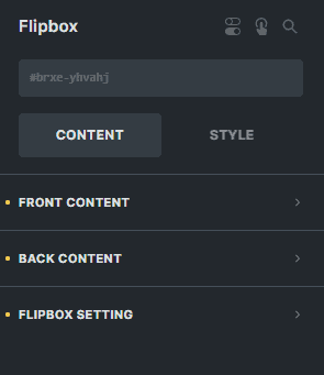
Front Content
Content-Type
Select the type either 'Content' which will let you customize your content or 'Template' which will let you use an already created template.
Content (For 'Content' in Content Type)
Icon
Choose an icon to display on your front content.
Use Icon Image
You can enable this option if you want to use an image instead of an icon. Leave it unchecked if you want to stick with an icon.
Icon Image
If 'Use Icon Image' is checked this option will appear to let you select an image for your front content.
Heading
Enter the text for the heading of your front content.
Subheading
Enter the text for the subheading of your front content.
Heading Tag
Select the HTML tag of your heading.
Content
Enter the text for the content of your front content.
Sets the background for your front content.
Back Content
Content-Type
Select the type either 'Content' which will let you customize your content or 'Template' which will let you use an already created template.
Content (For 'Content' in Content Type)
Icon
Choose an icon to display on your back content.
Use Icon Image
You can enable this option if you want to use an image instead of an icon. Leave it unchecked if you want to stick with an icon.
Icon Image
If 'Use Icon Image' is checked this option will appear to let you select an image for your back content.
Link
Enter the link where you want to redirect your visitors when the icon or image is clicked in the back content.
Heading
Enter the text for the heading of your back content.
Subheading
Enter the text for the subheading of your back content.
Heading Tag
Select the HTML tag of your heading.
Content
Enter the text for the content of your back content.
Sets the background for your back content.
Button
Use Button
You can enable this option if you want to use a button in your back content. Leave it unchecked if you will not need a button in your back content.
Flipbox Setting
Height
Enter a number for the height of the box
Animation Duration
The duration of the animation when the box flips.
Effect
Sets the effect when the box flips.
Flip Animation
Sets the direction where the box will turn when the box flips.
3D Effect
You can enable this option if you want to enable the 3D effect on your flip box.
Use Elastic Effect
You can enable this option if you want to enable the elastic effect when you hover over your flip box.
Style Options
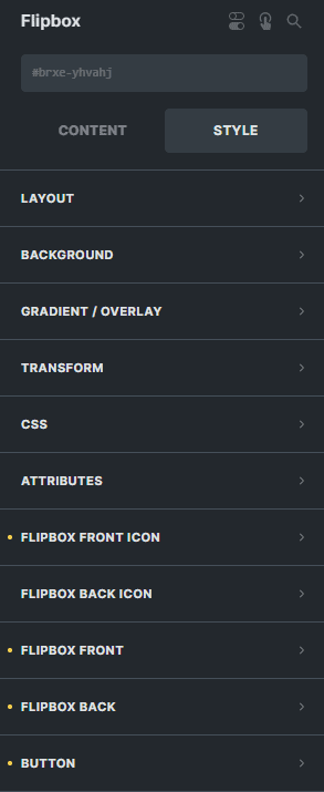
Flipbox Front Icon
Icon Margin
Sets the margin of the icon or image in the front content.
Icon Padding
Sets the padding of the icon or image in the front content.
Icon Position
Sets the position of the icon or image in the front content.
Icon Background
Sets the background color of the icon or image in the front content.
Icon Border
Settings of the border for the icon or image in the front content.
Settings of the box shadow for the icon or image in the front content.
Flipbox Back Icon
Icon Margin
Sets the margin of the icon or image in the back content.
Icon Padding
Sets the padding of the icon or image in the back content.
Icon Position
Sets the position of the icon or image in the back content.
Icon Size
Sets the size of the icon or image in the back content.
Icon Height
Sets the height of the icon or image in the back content.
Icon Width
Sets the width of the icon or image in the back content.
Icon Background
Sets the background color of the icon or image in the back content.
Icon Border
Settings of the border for the icon or image in the back content.
Settings of the box shadow for the icon or image in the back content.
Flipbox Front
Text Align
Sets the horizontal alignment of the contents of the front content.
Vertical Align
Sets the vertical alignment of the contents of the front content.
Heading Typography
Customize the color, font, size, weight, family, style, line height, and letter spacing, and add shadow to the heading of the front content.
Heading Gap
Sets the gap between the heading from the content and the subheading in the front content.
Body Typography
Customize the color, font, size, weight, family, style, line height, and letter spacing, and add shadow to the content or body of the front content.
Subheading Typography
Customize the color, font, size, weight, family, style, line height, and letter spacing, and add shadow to the subheading of the front content.
Use Gradient
You can enable this option if you want to use a gradient for Front Content.
Border
Settings of the border for the whole front content.
Settings of the box shadow for the whole front content.
Margin
Sets the margin for the whole front content.
Padding
Sets the padding for the whole front content.
Flipbox Back
Text Align
Sets the horizontal alignment of the contents of the back content.
Vertical Align
Sets the vertical alignment of the contents of the back content.
Heading Typography
Customize the color, font, size, weight, family, style, line height, and letter spacing, and add shadow to the heading of the back content.
Heading Gap
Sets the gap between the heading from the content and the subheading in the back content.
Body Typography
Customize the color, font, size, weight, family, style, line height, and letter spacing, and add shadow to the content or body of the back content.
Subheading Typography
Customize the color, font, size, weight, family, style, line height, and letter spacing, and add shadow to the subheading of the back content.
Use Gradient
You can enable this option if you want to use a gradient for Back Content.
Border
Settings of the border for the whole back content.
Settings of the box shadow for the whole back content.
Margin
Sets the margin for the whole back content.
Padding
Sets the padding for the whole back content.
Button
Margin
Sets the margin for the button in the back content.
Padding
Sets the padding for the button in the back content.
Typography
Customize the color, font, size, weight, family, style, line height, and letter spacing, and add shadow to the text of the button in the back content.
Background
Sets the background color of the text of the button in the back content.
Border
Settings of the border for the button in the back content.
Settings of the box shadow for the button in the back content.