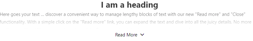
A Read More Element is a common web design component used to provide a condensed preview of content with an option to expand and reveal the full content.
Content Options
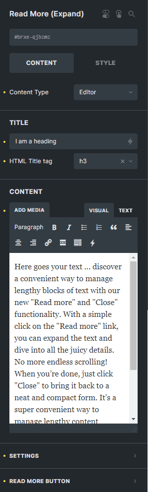
Content Type
Choose the content type of the element either 'Editor' or 'Nestable'.
Title
Enter the text to set the title of the element.
HTML Title tag
Select the HTML tag of the heading.
Content
Enter the text to set the contents of the element.
Settings
Start on Open
You can enable this option to show all content when the page is loaded.
Animation Speed (ms)
Enter the number to set the speed of the animation in milliseconds.
The maximum height of the component in its collapsed state.
Height Margin (px)
Avoids collapsing blocks that are only slightly larger than collapsed height.
Show Gradient
You can enable this option to add a blury effect on your content when the element is collapsed.
Settings
More Text
Enter the text to set the text in button when content is collapsed.
Less Text
Enter the text to set the text in button when content is expanded.
Style
Typography
Customize the color, font, size, weight, family, style, line height, and letter spacing, and add shadow to the read more button.
Background
Sets the background of the read more button.
Border
Sets the border of the read more button.
Box Shadow
Sets the box shadow of the read more button.
Text Align
Select the text alignment of the read more button text.
Align
Select the vertical alignment of the read more button.
Margin
Sets the margin of the read more button text.
Padding
Sets the padding of the read more button text.
Icon
Use Button Icon
You can enable this option to display an icon in your read more button.
Read More Icon
Choose the icon to display the read more button when collapsed.
Read More Icon Typography
Customize the color, font, size, style, and decoration, and add shadow to the icon inside the collapsed read more button.
Less Icon
Choose the icon to display the read more button when expanded.
Less Icon Typography
Customize the color, font, size, style, and decoration, and add shadow to the icon inside the expanded read more button.
Icon Gap
Enter the number to set the gap between the text and the icon in your read more button.
Style Options
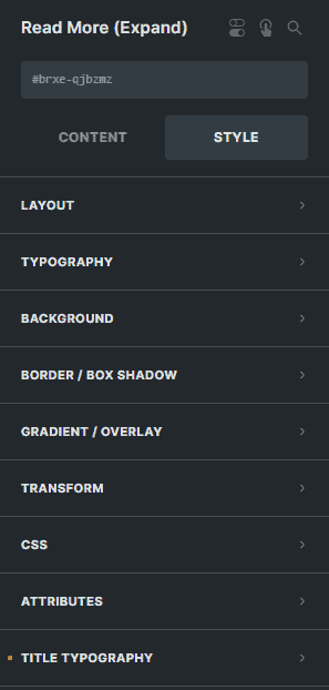
Title Typography
Color
Sets the color of the heading of the element.
Font Size
Enter the number to set the font size of the heading of the element.
Text Align
Select the text alignment of the heading of the element.
Text transform
Select the text transform of the heading of the element.
Font Family
Select the font family of the heading of the element.
Font Weight
Select the font weight of the heading of the element.
Font Style
Select the font style of the heading of the element.
Line Height
Enter the number to set the line height of the heading of the element.
Letter Spacing
Enter the number to set the letter spacing of the heading of the element.
Text shadow
Sets the text-shadow of the heading of the element.
Text decoration
Select the text decoration of the heading of the element.
Margin
Sets the margin of the heading of the element.
Padding
Sets the padding of the heading of the element.