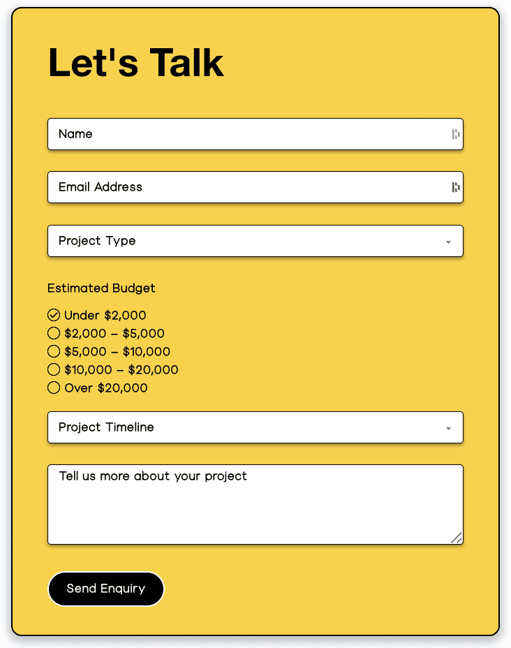
With Contact Form 7, crafting stylish and functional contact forms becomes effortless. Its powerful customization capabilities make it simple to build forms that seamlessly match your website’s aesthetic.
Content Options
Contact Form
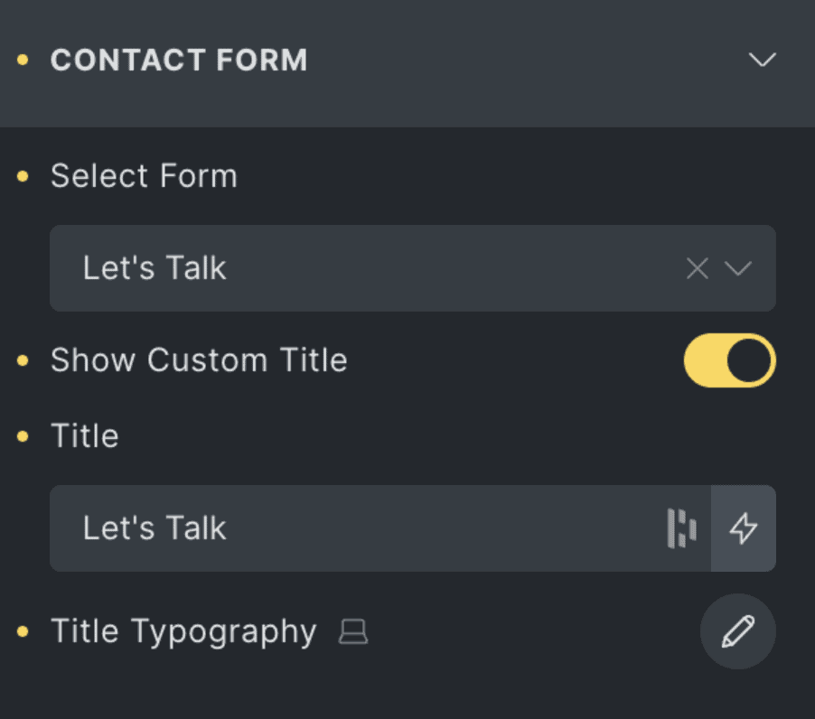
Select Form | Choose an existing CF7 form from the dropdown to embed in your layout. |
Show Custom Title | Toggle to enable or disable a custom title above the form. |
Title | Enter a custom title to display above the form. Only visible if “Show Custom Title” is enabled. |
Title Typography | Customize the typography of the form title using the typography editor. |
Input Fields
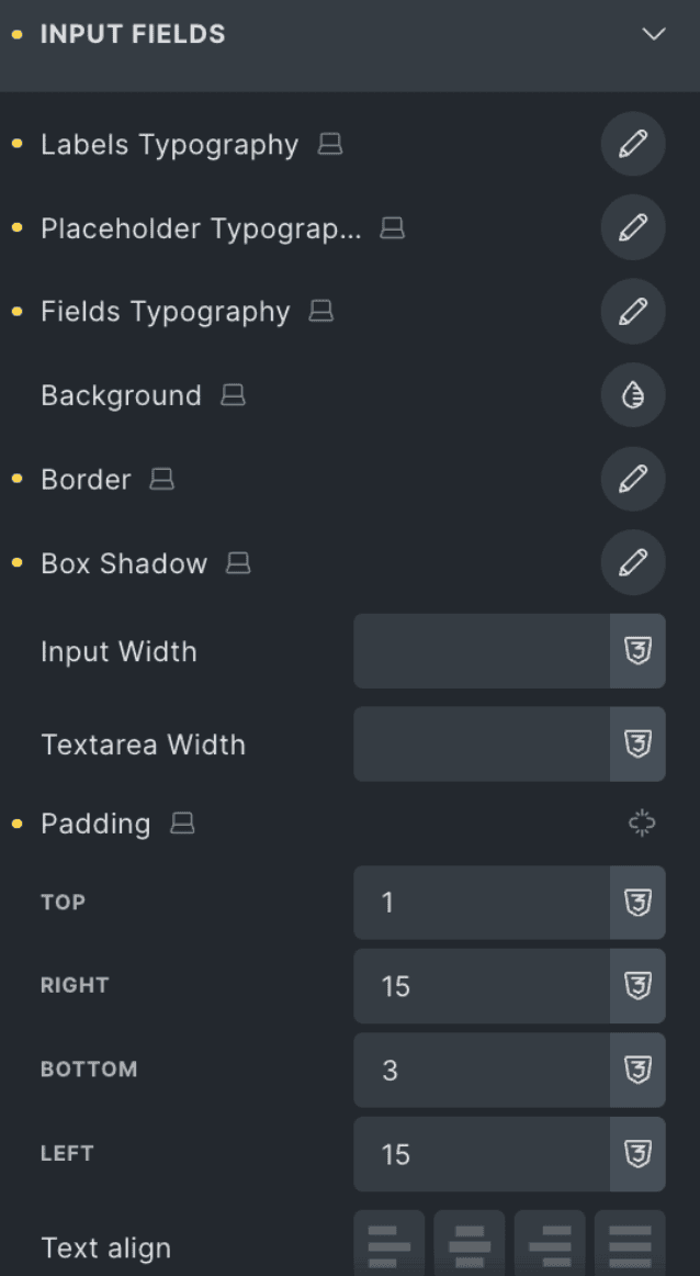
Labels Typography | Style the text used for input field labels. |
Placeholder Typography | Style the placeholder text inside input fields. |
Fields Typography | Style the main text entered in input fields. |
Background | Set the background color or style of input fields. |
Border | Adjust the border style, width, and color of input fields. |
Box Shadow | Add and style shadows around input fields. |
Input Width | Define the width of the standard input fields. |
Textarea Width | Define the width for textarea fields separately. |
Padding | Set internal spacing (top, right, bottom, left) for input fields. |
Text Align | Align the text within the input field (left, center, right, justify). |
Spacing
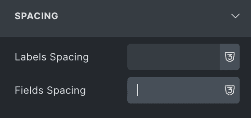
Labels Spacing | Set the vertical spacing between labels and their corresponding input fields. |
Fields Spacing | Define the spacing between individual input fields. |
File
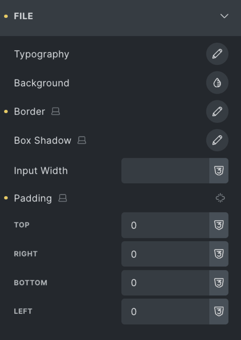
Typography | Customize the font style for file input labels. |
Background | Set the background color for file input fields. |
Border | Define the border style for file inputs. |
Box Shadow | Add shadow effects to the file input field. |
Input Width | Set the width of the file upload field. |
Padding | Adjust internal spacing for the file input (top, right, bottom, left). |
File Button
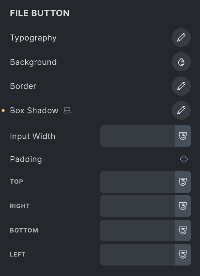
Typography | Style the font used on the file upload button. |
Background | Set the background of the upload button. |
Border | Adjust border settings of the upload button. |
Box Shadow | Apply shadow styling to the upload button. |
Input Width | Set the width of the file upload button. |
Padding | Adjust internal spacing inside the button. |
Dropdown
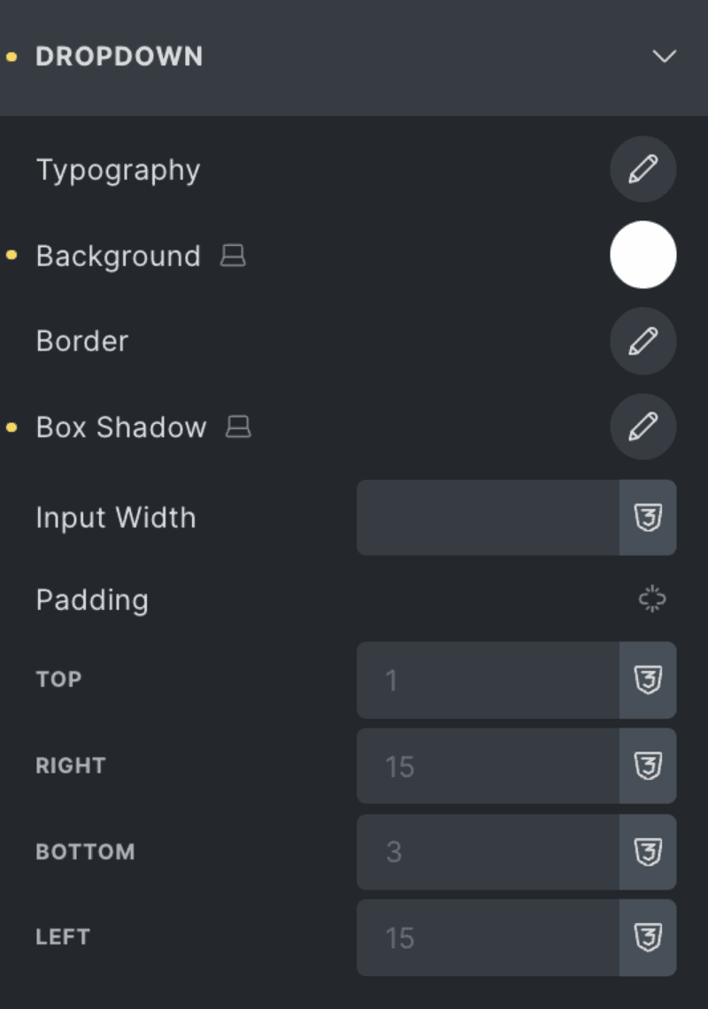
Typography | Set the font for dropdown text. |
Background | Define the dropdown’s background color. |
Border | Customize the dropdown border. |
Box Shadow | Add shadow to dropdowns. |
Input Width | Define how wide the dropdown should appear. |
Padding | Adjust inner spacing within the dropdown. |
Date
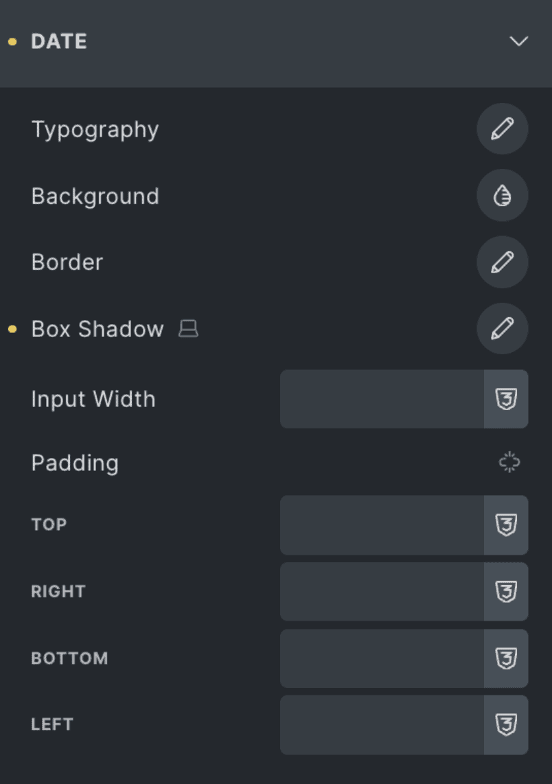
Typography | Set font styles for date field content. |
Background | Choose a background for the date picker input. |
Border | Define the border styling. |
Box Shadow | Apply box shadow to the date input field. |
Input Width | Set how wide the date field should be. |
Padding | Adjust spacing inside the date field. |
Radio
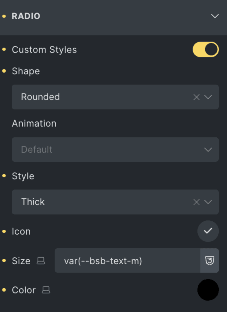
Custom Styles | Toggle on to use your own custom styling. |
Shape | Select between different radio shapes (e.g., square, curved, rounded). |
Animation | Choose animation effect when toggled. |
Style | Choose the radio button visual style. |
Icon | Choose a custom icon for the selected radio state. |
Size | Set the size of the custom icon. |
Color | Select the color of the custom icon. |
Checkbox
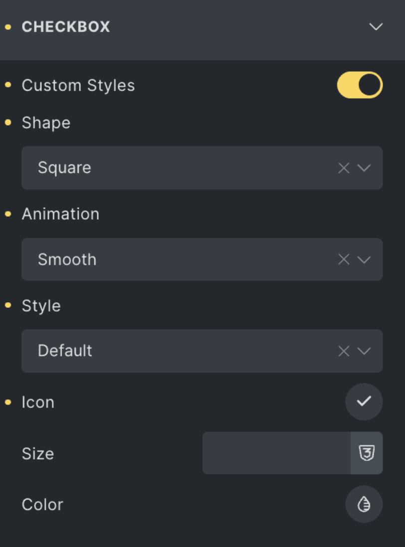
Custom Styles | Toggle on to use your own checkbox styling. |
Shape | Select between different checkbox shapes (e.g., square, curved, rounded). |
Animation | Choose animation effect when toggled. |
Style | Choose the checkbox visual style. |
Icon | Choose a custom icon for the selected checkbox state. |
Size | Set the size of the custom icon. |
Color | Select the color of the custom icon. |
Acceptance
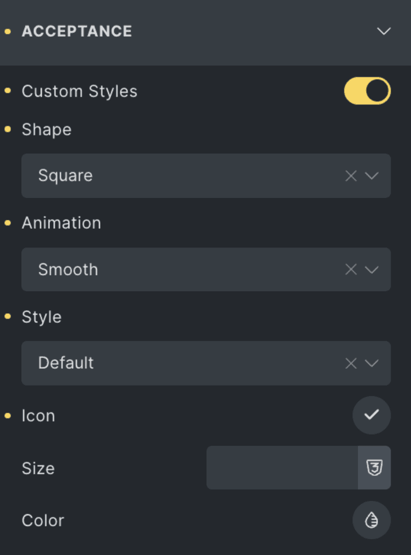
| Toggle on to use your own custom styling. |
Shape | Select between different checkbox shapes (e.g., square, curved, rounded). |
Animation | Choose animation effect when toggled. |
Style | Choose the checkbox visual style. |
Icon | Choose a custom icon for the selected acceptance state. |
Size | Set the size of the custom icon. |
Color | Select the color of the custom icon. |
Submit Button
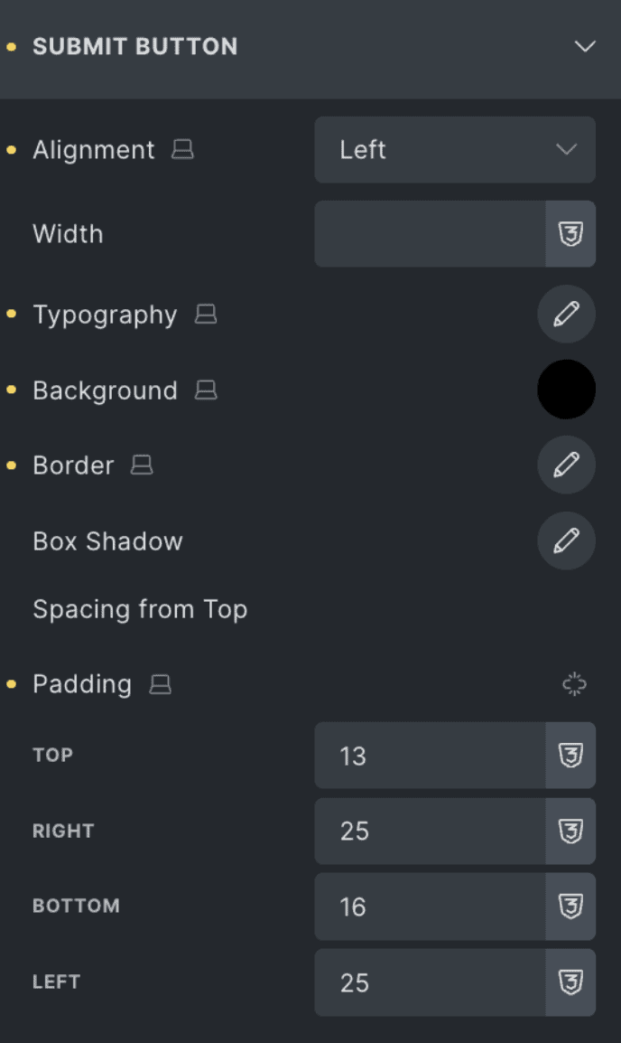
Alignment | Choose the horizontal alignment of the submit button (Left, Center, Right). |
Width | Set a custom width for the submit button. Leave blank for auto width based on content. |
Typography | Customize the font style, size, weight, and spacing of the button text. |
Background | Set the background color of the submit button. |
Border | Adjust the border style, thickness, and color for the button. |
Box Shadow | Add a shadow effect around the submit button for depth. |
Spacing from Top | Define the vertical spacing between the form fields and the submit button. |
Padding | Adjust the internal spacing within the button (Top, Right, Bottom, Left). |