The Back to Top Element is a user-friendly and easy-to-set-up tool that allows users to easily navigate to the top of a web page with just one click.
Content Options
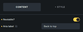
Controls basic behavior and accessibility.
Option | Description |
|---|---|
Nestable | Allows the element to be placed inside another element. |
Aria Label | Accessibility label for screen readers. |
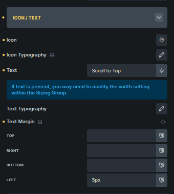
Icon / Text
Controls the visible content of the button.
This section is shown only when Nestable is disabled.
Option | Description |
|---|---|
Icon | Selects the icon shown on the button. |
Icon Typography | Controls the icon size and styling. |
Text | Text displayed alongside or instead of the icon. |
Text Typography | Controls font styling of the text (shown when Text is used). |
Text Margin | Controls spacing around the text (shown when Text is used). |
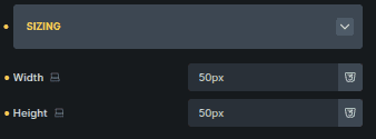
Sizing
Controls the overall size of the button.
Option | Description |
|---|---|
Width | Sets the button width. |
Height | Sets the button height. |
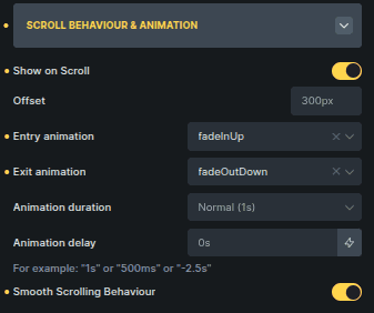
Scroll Behaviour & Animation
Controls when the button appears and how it animates.
Option | Description |
|---|---|
Show on Scroll | Displays the button only after scrolling. |
Offset | Defines how far the page must scroll before the button appears. |
Entry Animation | Animation used when the button enters the viewport. |
Exit Animation | Animation used when the button leaves the viewport. |
Animation Duration | Controls the speed of the animation. |
Animation Delay | Adds a delay before the animation starts. |
Smooth Scrolling Behaviour | Enables smooth scrolling back to the top. |
Scroll-related options are shown only when Show on Scroll is enabled.
Position
Controls where the button appears on the page.
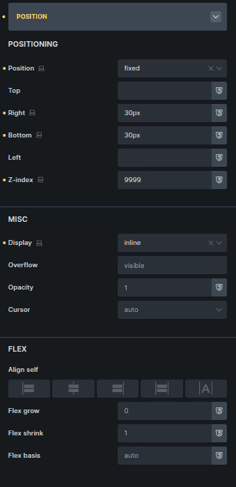
Option | Description |
|---|---|
Position | Controls where the button is placed on the page. |
Misc | Manages visibility and interaction properties like display, overflow, opacity, and cursor. |
Flex Options | Aligns and positions the button’s inner content using flex controls. |
This section provides layout control without affecting scroll behavior.