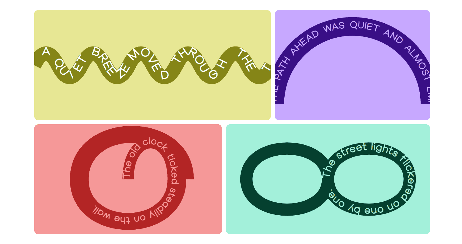
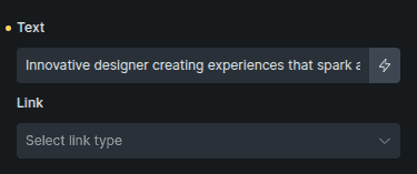
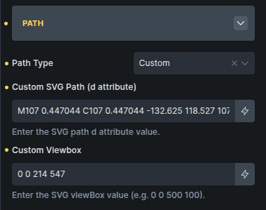
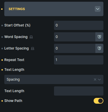
Turn typography into a design element. Guide text along creative paths to add depth, motion, and visual interest to any layout.
Content Options
Controls the text content and the path it follows.
Option | Description |
|---|---|
Text | The text that will follow the selected path. |
Link | Adds a link to the text path. |
Path
Defines the shape that the text follows.
Option | Description |
|---|---|
Path Type | Selects the predefined shape the text will follow. |
Custom SVG Path (d attribute) * | Allows you to define a custom SVG path. |
Custom Viewbox * | Defines the SVG viewbox for the custom path. |
Options marked with * appears only when Path Type is set to Custom.
Settings
Controls spacing, alignment, and visibility of the path.
Option | Description |
|---|---|
Start Offset (%) | Moves the starting point of the text along the path. |
Word Spacing | Adjusts spacing between words. |
Letter Spacing | Adjusts spacing between individual letters. |
Repeat Text | Repeats the text multiple times along the path. |
Text Length | Controls how text spacing is calculated along the path. |
Text Length Value | Defines the custom length used when spacing modes are selected. |
Show Path | Displays the path line for visual styling. |
Text Length Value appears only when Text Length is set to Spacing or Spacing & Glyph.
Style Options
Path
Controls the appearance of the path and SVG container.
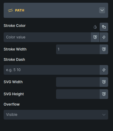
Option | Description |
|---|---|
Stroke Color * | Sets the color of the visible path line. |
Stroke Width * | Controls the thickness of the path line. |
Stroke Dash * | Creates dashed or patterned path lines. |
SVG Width | Sets the width of the SVG container. |
SVG Height | Sets the height of the SVG container. |
Overflow | Controls how content behaves when it exceeds the SVG area. |
Options marked with * are shown only when Show Path is enabled in the Content settings.