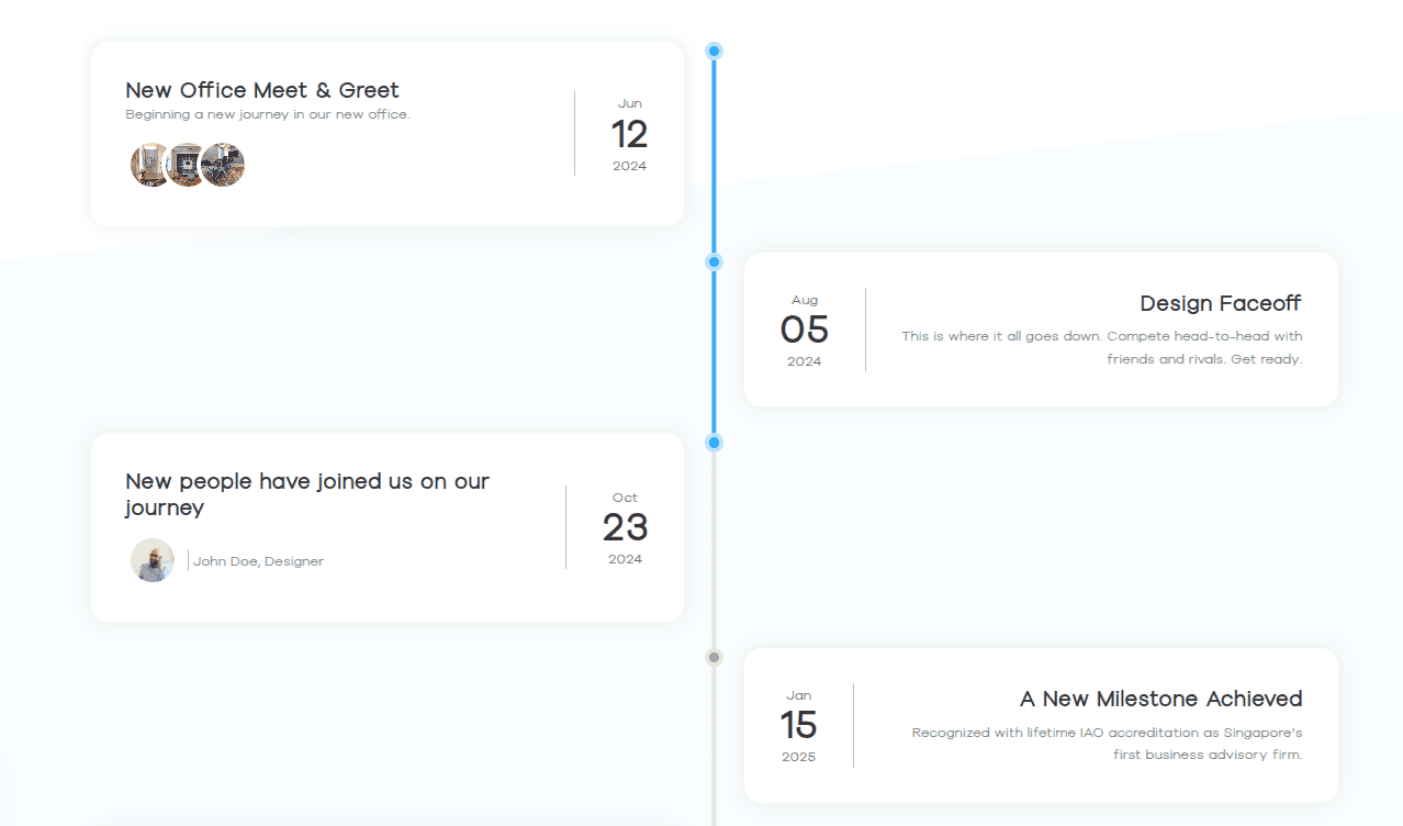
Elevate your WordPress storytelling using the versatile Bricksable Content Timeline element. With this powerful element, you can effortlessly create dynamic, interactive timelines—featuring customizable pointers, scroll-progress tracking, and flexible alignment options—to clearly present your journey, boost user engagement, and design every content block directly within Bricks Builder.
Content Options
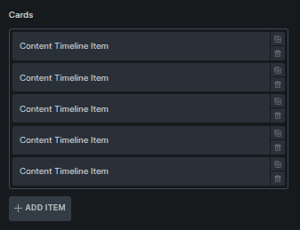
Cards
Manage individual timeline items.
Option | Description |
|---|---|
Card List | Displays all timeline items in order. |
Add Item | Adds a new timeline card to the list. |
Clicking a card opens its individual settings (documented below).
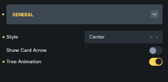
General
Global layout and interaction settings for the timeline.
Option | Description |
|---|---|
Style | Aligns the timeline layout (Left, Center, or Right). |
Show Card Arrow | Shows or hides the arrow connecting cards to the timeline. |
Tree Animation | Enables animated movement along the timeline tree. |
Style Options
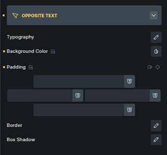
Opposite Text
Styles the text displayed opposite each timeline card.
Option | Description |
|---|---|
Typography | Controls font style, size, and spacing. |
Background Color | Sets the background behind opposite text. |
Padding | Adds inner spacing around the text. |
Border | Adds a border around the opposite text area. |
Box Shadow | Applies shadow for depth and separation. |
Pointer
Styles the timeline pointer.
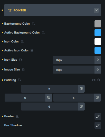
Option | Description |
|---|---|
Background Color | Sets the default pointer background color. |
Active Background Color | Sets the pointer background for the active card. |
Icon Color | Controls the pointer icon color. |
Active Icon Color | Changes icon color for the active state. |
Icon Size | Adjusts the size of the pointer icon. |
Image Size | Adjusts the size of the pointer image. |
Padding | Adds spacing inside the pointer. |
Border | Adds a border around the pointer. |
Box Shadow | Applies shadow to the pointer. |
Tree
Controls the timeline line itself.
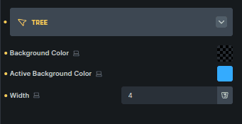
Option | Description |
|---|---|
Background Color | Sets the default timeline line color. |
Active Background Color | Changes the line color for the active section. |
Width | Adjusts the thickness of the timeline line. |
Timeline Item Content Options
Controls content shown inside a single timeline card.
Opposite Text
Controls text displayed opposite the card.
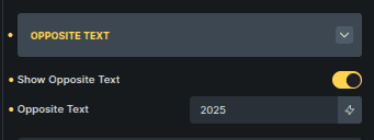
Option | Description |
|---|---|
Show Opposite Text | Enables or disables opposite text for this card. |
Opposite Text | Text shown on the opposite side of the timeline (shown when enabled). |
Pointer
Controls the pointer style for this specific card.
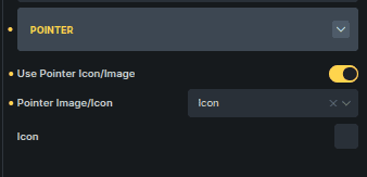
Option | Description |
|---|---|
Use Pointer Icon/Image | Switches between an icon or image pointer. |
Pointer Image/Icon | Selects whether to use an image or icon. |
Image / Icon Selector | Choose the specific image or icon to display. |
Notes on Behavior
Timeline items share the same global style settings, but content can vary per card.
Some pointer-related options depend on whether icon or image mode is selected.
The overall structure and controls remain consistent across all cards.