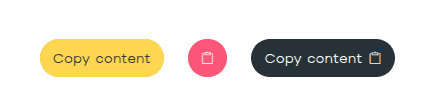
Streamline your user experience with the versatile Bricksable Copy to Clipboard element. This powerful utility allows you to target anything from CSS selectors to dynamic data, creating a seamless “click-to-copy” flow. With customizable success states, animated icons, and smart tooltips, you can provide instant visual feedback and professional polish directly within Bricks Builder.
Content Options
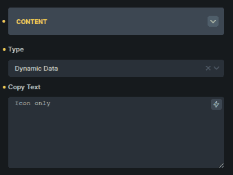
Content
Controls what content gets copied.
Option | Description |
|---|---|
Type | Chooses what will be copied (Dynamic Data or Choose Selector). |
Copy Text | Text to copy when Dynamic Data is selected. |
Copy Selector | CSS selector of the element to copy when Choose Selector is selected. |
The available options change based on the selected Type.
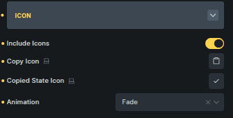
Icon
Controls icons and visual feedback for copy actions.
Option | Description |
|---|---|
Include Icons | Enables icons inside the button. |
Copy Icon | Icon shown before the content is copied. |
Copied State Icon | Icon shown after copying is complete. |
Animation | Animation applied when the icon changes state. |
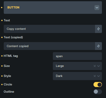
Button
Controls the button appearance and behavior.
Option | Description |
|---|---|
Text | Button label before copying. |
Text (Copied) | Button label after copying. |
HTML Tag | Sets the HTML element used for the button. |
Size | Controls the button size. |
Style | Sets the button visual style. |
Circle | Applies rounded button styling. |
Outline | Displays the button in outline style. |
Tooltip
Controls tooltip behavior and messaging.
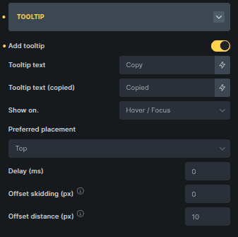
Option | Description |
|---|---|
Add Tooltip | Enables tooltip display. |
Tooltip Text | Text shown before copying. |
Tooltip Text (Copied) | Text shown after copying. |
Show On | Defines when the tooltip appears. |
Preferred Placement | Sets the tooltip position. |
Delay (ms) | Adds a delay before the tooltip appears. |
Offset Skidding (px) | Controls distance along the side of the button. |
Offset Distance (px) | Controls distance away from the button. |