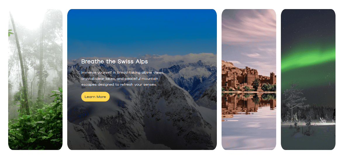
Showcase your images with impact using the Bricksable Image Accordion element. Create interactive, animated accordion-style galleries that respond beautifully on hover—perfect for highlighting features, products, or visual stories in Bricks Builder.
Content Options
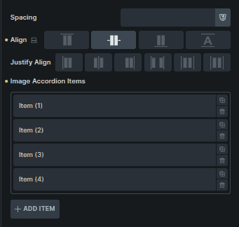
Layout and Image Accordion Items
Basic layout and alignment controls.
Option | Description |
|---|---|
Spacing | Controls the gap between accordion items. |
Align | Aligns accordion items along the cross axis. |
Justify Align | Controls how items are distributed within the accordion. |
Card List | Displays all accordion items. |
Add Item | Adds a new accordion item. |
Clicking an item opens its individual settings (documented below).
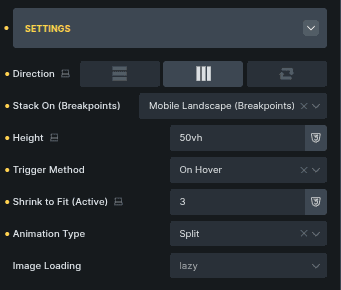
Settings
Controls overall accordion behavior and interaction.
Option | Description |
|---|---|
Direction | Sets the accordion flow (Vertical, Horizontal, Reverse). |
Stack On | Defines when items stack on smaller screens. |
Height | Sets the overall height of the accordion. |
Trigger Method | Chooses how items activate (On Hover or On Click). |
Shrink to Fit (Active) | Controls how much inactive items shrink. |
Animation Type | Sets the transition animation between items. |
Image Loading | Controls how images load (Lazy or Eager). |
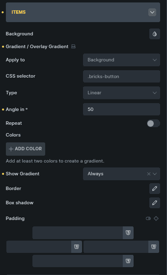
Items
Controls background and visual styling for accordion items.
Option | Description |
|---|---|
Background | Sets the item background color. |
Gradient / Overlay Gradient | Adds a gradient to background, overlay, or text. |
Apply To | Chooses where the gradient is applied. |
CSS Selector | Applies styles to a custom selector. |
Type | Selects gradient type (Linear, Radial, Conic). |
Angle In | Controls gradient direction. |
Repeat | Repeats the gradient pattern. |
Colors | Manages gradient colors. |
Show Gradient | Controls when the gradient is visible. |
Border | Adds a border around items. |
Box Shadow | Adds depth using shadow. |
Padding | Adds inner spacing to items. |
Title
Controls the appearance of item titles.
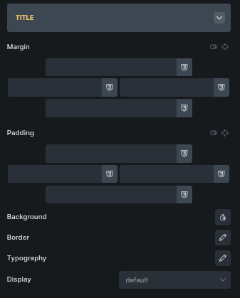
Option | Description |
|---|---|
Margin | Controls spacing around the title. |
Padding | Adds inner spacing to the title. |
Background | Sets the title background color. |
Border | Adds a border around the title. |
Typography | Controls font styling. |
Display | Controls how the title is displayed. |
Subheading
Styles the subheading text.
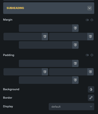
Option | Description |
|---|---|
Margin | Controls spacing around the subheading. |
Padding | Adds inner spacing. |
Background | Sets background color. |
Border | Adds a border. |
Display | Controls visibility and layout behavior. |
Content
Controls the main content layout inside accordion items.
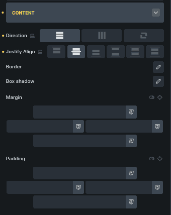
Option | Description |
|---|---|
Direction | Sets content flow direction. |
Justify Align | Aligns content within the item. |
Border | Adds a border around content. |
Box Shadow | Applies shadow styling. |
Margin | Controls outer spacing. |
Padding | Adds inner spacing. |
Icon
Controls the icon displayed within an accordion item.
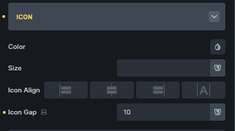
Option | Description |
|---|---|
Color | Sets the icon color. |
Size | Adjusts the icon size. |
Icon Align | Aligns the icon relative to content. |
Icon Gap | Sets spacing between icon and text. |
Overlay Text
Controls text shown as an overlay on accordion images.
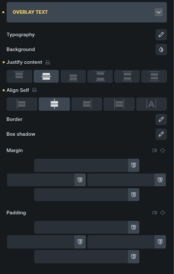
Option | Description |
|---|---|
Typography | Controls font styling. |
Background | Sets overlay background color. |
Justify Content | Aligns overlay content horizontally. |
Align Self | Aligns overlay vertically. |
Border | Adds a border to the overlay. |
Box Shadow | Adds depth to overlay text. |
Margin | Controls outer spacing. |
Padding | Adds inner spacing. |
Accordion Item Settings
Each accordion item has its own content and media options.
State & Background
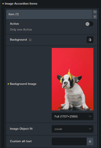
Option | Description |
|---|---|
Active | Sets the item as active by default. |
Background | Sets the item background color. |
Background Image | Sets the image shown for the item. |
Image Object Fit | Controls how the image fits the container. |
Custom Alt Text | Adds custom alt text for accessibility. |
Text Content
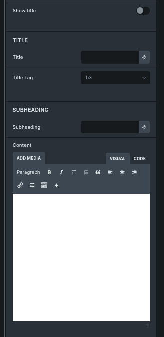
Option | Description |
|---|---|
Show Title | Shows or hides the title. |
Title | Main heading text. |
Title Tag | Sets the HTML tag for the title. |
Subheading | Secondary text below the title. |
Content | Main descriptive text. |
Icon & Media
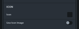
Option | Description |
|---|---|
Icon | Selects an icon. |
Use Image | Switches from icon to image. |
Icon Image | Selects an image when image mode is enabled. |
Button
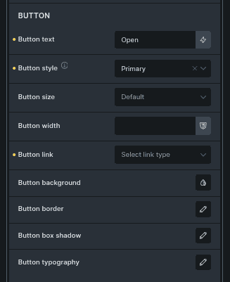
Option | Description |
|---|---|
Button Text | Text displayed on the button. |
Button Style | Sets the button visual style. |
Button Size | Controls button size. |
Button Width | Sets button width. |
Button Link | Defines the button destination. |
Button Background | Sets button background color. |
Button Border | Adds a border to the button. |
Button Box Shadow | Adds shadow styling. |
Button Typography | Controls button text styling. |
Overlay Text (Item)
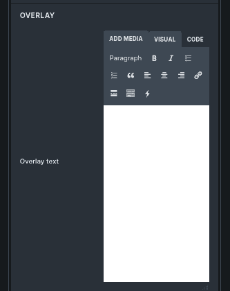
Option | Description |
|---|---|
Overlay Text | Text displayed over the image. |
Notes on Behavior
Only one item can be active by default.
Some options appear based on selected modes (icon vs image, trigger type).
Styling is shared globally, while content is configured per item.