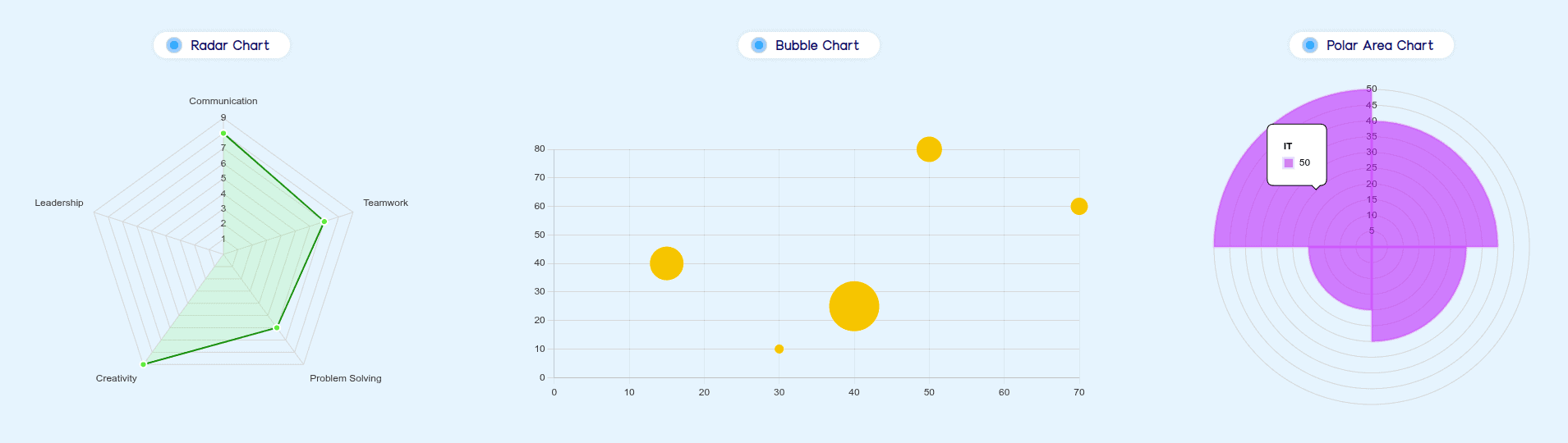
With Bricksable Charts element, you can effortlessly create a variety of animated and interactive charts—including Bar, Bubble, Doughnut, Pie, Line, Polar Area, Radar and Scatter—to clearly present your data, boost user engagement, and customize the visual experience directly within Bricks Builder.
Content Options
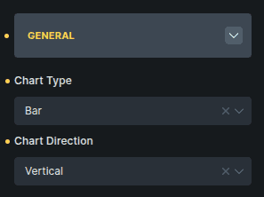
General
General settings define the chart's global type and layout before data or appearance configuration.
Option | Description |
|---|---|
Chart Type | Select the style of chart you want to display. You can choose from 8 different chart types: Bar, Bubble, Doughnut, Pie, Line, Polar Area, Radar, and Scatter. |
Chart Direction | Controls the orientation of supported chart types. For example, bar charts can switch between vertical and horizontal layouts. |
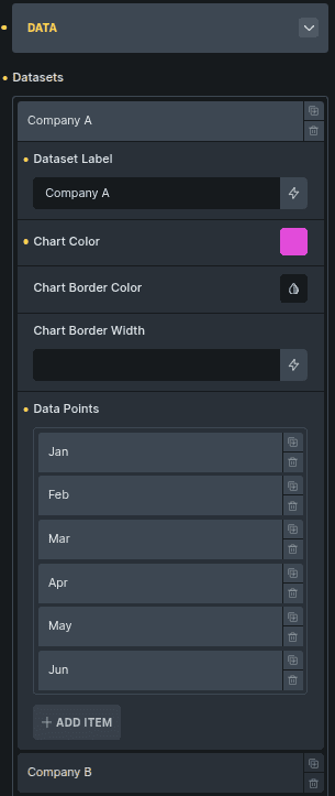
Data
Charts are powered through datasets, and each dataset contains its own visual settings and a list of data points. While some chart types may use slightly different data fields, the structure and purpose remain the same across all chart options.
Option | Description |
|---|---|
Datasets | A collection of one or more datasets used to generate the chart. Each dataset controls its own label, colors, and data values. |
Dataset Label | The name of the dataset that appears in the chart legend. Useful when multiple datasets are displayed together. |
Chart Color | The main color applied to this dataset. Depending on the chart, this may control bar fill, line color, area shading, or slice color. |
Chart Border Color | Sets the border color used around chart elements such as bars, lines, or data markers. |
Chart Border Width | Controls the thickness of the dataset’s border styling. |
Data Points | A list of items that represent the actual plotted values for the dataset. While the exact required fields can vary by chart type, every chart uses this section to define the plotted data. |
Label (Data Point) | The title or name of the data point. Typically shown on the axis or used to identify the value being plotted. |
Value (Data Point) | The numeric value associated with the data point. The chart uses this value to determine size, height, or position depending on the chart style. |
Note About Other Chart Types
Some chart types require additional or slightly different data fields inside Data Points.
However, the overall structure remains the same:
You create datasets
Each dataset contains styling controls
Each dataset includes data points
Data points define the values that appear on the chart
This keeps the workflow consistent across all chart types.
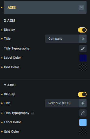
Axes
Axes allow you to control the visibility, labeling, and styling of the horizontal and vertical axes in your charts. These settings apply across all chart types that support axes.
Option | Description |
|---|---|
Display | Toggles the visibility of the axis. When disabled, the entire axis—including labels and grid lines—is hidden. |
Title | Adds a descriptive title to the axis. Useful for clarifying what the axis values represent (e.g., “Months”, “Revenue”, “Visitors”). |
Title Typography | Customize the font style for the axis title, including size, weight, and spacing. |
Label Color | Sets the color for individual axis labels (e.g., X-axis categories or Y-axis numeric values). |
Grid Color | Defines the color of the grid lines drawn across the chart area. Adjust this to enhance readability or match your design theme. |
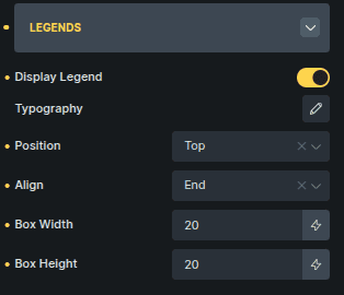
Legends
Legends help users understand what each dataset or item in the chart represents. You can customize their visibility, styling, and positioning.
Option | Description |
|---|---|
Display Legend | Toggles the legend on or off. When disabled, the legend is completely removed from the chart area. |
Typography | Customize the font style used for legend labels. |
Position | Sets where the legend appears around the chart. Common positions include top, bottom, left, and right. |
Align | Controls how the legend items are aligned within the chosen position (e.g., start, center, end). |
Box Width | Defines the width of the small color box shown next to each legend label. |
Box Height | Defines the height of the color box. |
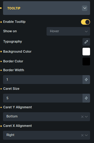
Tooltip
Tooltips display additional information when interacting with the chart (e.g., hovering or clicking). You can customize their appearance and behavior.
Option | Description |
|---|---|
Enable Tooltip | Toggles tooltip visibility on interaction. When disabled, tooltips will not appear. |
Show On | Determines the interaction that triggers the tooltip (e.g., hover, click). |
Typography | Controls the font style used inside the tooltip. |
Background Color | Sets the tooltip’s background color. |
Border Color | Defines the color of the tooltip border. |
Border Width | Adjusts the thickness of the tooltip border. |
Caret Size | Controls the size of the tooltip pointer (the small triangular caret). |
Caret Y Alignment | Adjusts the vertical alignment of the caret relative to the tooltip box. |
Caret X Alignment | Adjusts the horizontal alignment of the caret. |
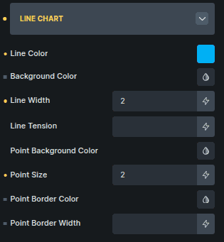
Chart-Specific Settings
Some customization options are unique to each chart type. When you select a chart (Bar, Line, Pie, etc.), the panel shows styling options that apply only to that specific chart.
These settings help you customize things like bar appearance, line style, point size, segment colors, and more — depending on the chart you’re working with.
How It Works (Short & Clear)
Each chart type includes a dedicated settings panel:
Bar Chart → Options for bar color, border, radius, etc.
Line Chart → Options for line color, tension, point size, etc.
Other chart types show similar chart-specific options tailored to their design.
The controls are different, but the purpose is the same:
to style the visual elements of the selected chart type.
Example Chart-Specific Options
Option | Description |
|---|---|
Line Color | Sets the stroke color of the line. |
Background Color | Controls the fill area under the line (if enabled). |
Line Width | Adjusts the thickness of the line. |
Line Tension | Controls the curve smoothness of the line. |
Point Background Color | Sets the fill color of point markers. |
Point Size | Adjusts the size of each data point marker. |
Point Border Color | Defines the border color of point markers. |
Point Border Width | Sets the border thickness for point markers. |