A flexible and extensible content element that comprises an image, a badge text, a title, a subheading, a description, and a Call-to-Action (CTA) button.
Content Options
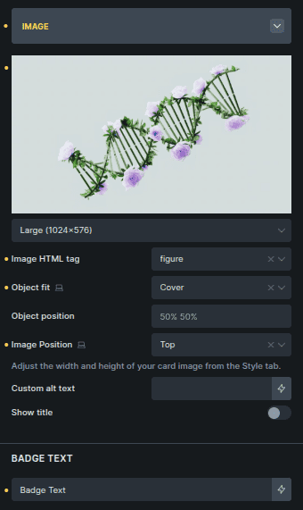
Image
Manages the card image and its placement.
Option | Description |
|---|---|
Image Selector | Selects the image used in the card. |
Image Size | Controls the image size. |
Image HTML Tag | Sets the HTML tag used for the image wrapper. |
Object Fit | Defines how the image fits inside its container. |
Object Position | Controls the image alignment inside its container. |
Image Position | Sets where the image appears in the card layout. |
Custom Alt Text | Adds custom alt text for accessibility. |
Show Title | Displays the title over the image when enabled. |
Badge text | Add text for the badge shown on the image. |
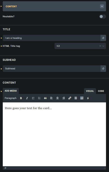
Content
Controls how card text content is added.
Option | Description |
|---|---|
Nestable | Allows content to be added using nested elements. |
Title * | Main heading text for the card. |
HTML Title Tag * | Sets the HTML tag for the title. |
Subhead * | Secondary text displayed below the title. |
Content * | Main descriptive text inside the card. |
Settings marked with * are only visible when Nestable is disabled.
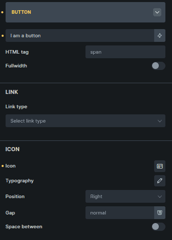
Button
Controls the card’s call-to-action button.
Option | Description |
|---|---|
Button Text | Text displayed on the button. |
HTML Tag | Sets the HTML element used for the button. |
Fullwidth | Expands the button to full card width. |
Link Type | Defines where the button links to. |
Icon | Selects an icon for the button. |
Typography * | Controls icon size and styling. |
Position * | Sets icon position relative to text. |
Gap * | Controls spacing between icon and text. |
Space Between * | Pushes icon and text to opposite sides. |
Settings marked with * are only visible when Icon is selected.
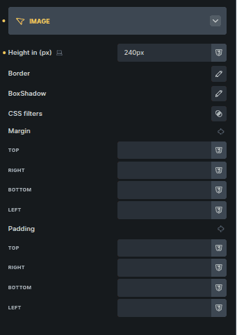
Style Options
Image
Styles the card image.
Option | Description |
|---|---|
Height (px) | Sets a fixed height for the image. |
Border | Adds a border to the image. |
Box Shadow | Applies shadow to the image. |
CSS Filter | Applies visual filters to the image. |
Margin | Controls spacing around the image. |
Padding | Adds inner spacing around the image. |
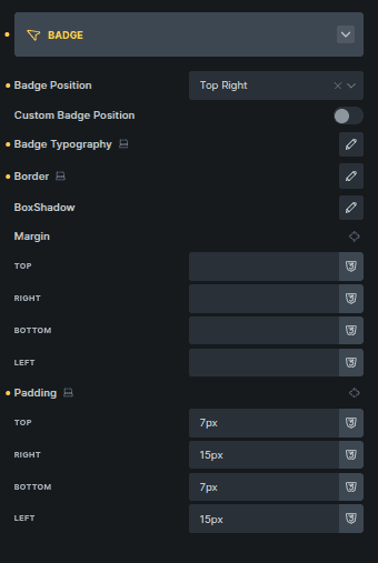
Badge
Controls badge placement and appearance.
Option | Description |
|---|---|
Badge Position | Sets predefined badge placement. |
Custom Badge Position | Enables custom positioning. |
Top (%) * | Adjusts vertical badge position. |
Left (%) * | Adjusts horizontal badge position. |
Badge Typography | Controls badge text styling. |
Border | Adds a border to the badge. |
Box Shadow | Applies shadow to the badge. |
Margin | Controls spacing around the badge. |
Padding | Adds inner spacing to the badge. |
Settings marked with * appear only when Custom Badge Position is enabled.
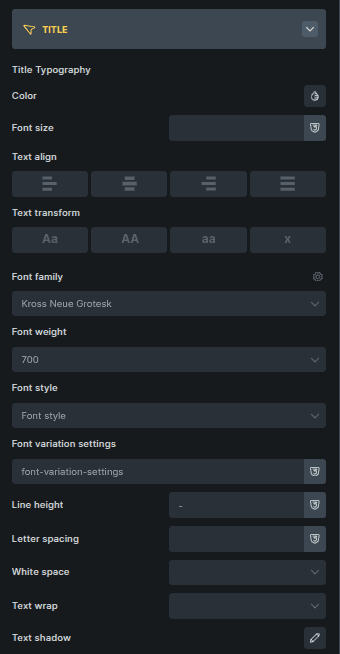
Title
Styles the card title.
Option | Description |
|---|---|
Color | Sets the title text color. |
Font Size | Controls text size. |
Text Align | Aligns the title text. |
Text Transform | Controls letter casing. |
Font Family | Sets the font family. |
Font Weight | Controls text thickness. |
Font Style | Applies italic or normal styling. |
Font Variation Settings | Adjusts variable font settings. |
Line Height | Controls vertical spacing. |
Letter Spacing | Adjusts space between letters. |
White Space | Controls text wrapping behavior. |
Text Wrap | Enables or disables text wrapping. |
Text Shadow | Applies shadow to the text. |
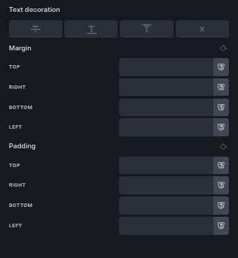
Text Decoration | Adds underline or other decorations. |
Margin | Controls spacing around the title. |
Padding | Adds inner spacing. |
Subhead
Controls subhead styling.
Uses the same styling options as Title.
Content
Controls main text styling.
Uses the same styling options as Title.
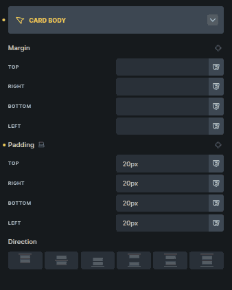
Card Body
Controls layout of the card’s content area.
Option | Description |
|---|---|
Margin | Controls spacing around the card body. |
Padding | Adds inner spacing. |
Direction | Sets content flow direction. |
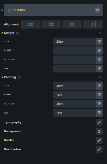
Button
Styles the card button.
Option | Description |
|---|---|
Alignment | Aligns the button within the card. |
Margin | Controls spacing around the button. |
Padding | Adds inner spacing. |
Typography | Controls button text styling. |
Background | Sets the button background. |
Border | Adds a border to the button. |
Box Shadow | Applies shadow to the button. |